The Importance of Data Presentation: Visuals and Graphs in Research Papers


Data presentation plays a crucial role in research papers, helping to communicate complex information clearly and effectively. Well-designed visuals and graphs not only enhance readability but also ensure that your findings are easily understood and impactful. This guide provides best practices for presenting data in your research papers.
Understanding the Role of Data Presentation
Why Data Presentation Matters?
Clarity: Visuals simplify complex data, making it easier for readers to grasp key points.
Engagement: Engaging visuals capture the reader’s attention and maintain their interest.
Impact: Effective data presentation highlights significant findings and supports your conclusions.
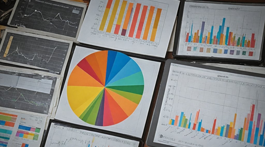
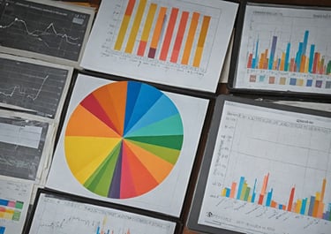
Types of Data Visualizations
Graphs and Charts
Bar Graphs: Useful for comparing quantities across different categories.
Engagement: Engaging visuals capture the reader’s attention and maintain their interest.
Pie Charts: Best for illustrating proportions and percentages.
Scatter Plots: Effective for displaying relationships between two variables.
Tables
Data Tables: Organize raw data systematically for detailed examination.
Summary Tables: Present key statistics and findings in a concise format.
Images and Diagrams
Photographs: Provide visual evidence or examples related to your research.
Diagrams: Explain processes, models, or frameworks clearly. To know more...
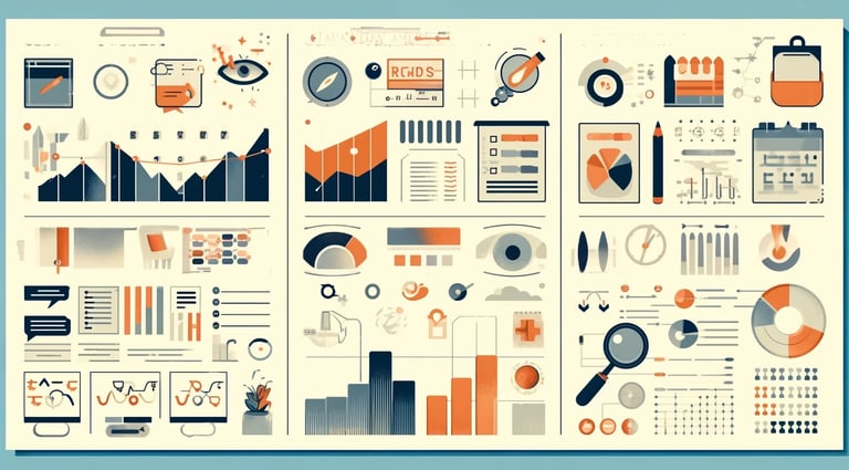
Best Practices for Creating Effective Visuals
Clarity and Simplicity
Keep it Simple: Avoid clutter by including only essential information.
Label Clearly: Ensure all axes, legends, and data points are clearly labeled.
Consistency
Use Consistent Styles: Maintain uniform colors, fonts, and scales throughout your visuals.
Standardized Units: Use consistent units of measurement to avoid confusion.
Accuracy
Ensure Precision: Double-check all data for accuracy before creating visuals.
Avoid Distortion: Present data accurately without exaggerating or minimizing findings.
Designing Visuals for Maximum Impact
Choosing the Right Type of Visualization
Match Data to Visual: Select the type of graph or chart that best represents your data.
Consider the Audience: Tailor visuals to the knowledge level and interests of your audience.
Highlighting Key Findings
Use Color Strategically: Highlight important data points or trends using contrasting colors.
Annotations: Add annotations or callouts to draw attention to significant findings.
Integrating Visuals into Your Research Paper
Placement and Context
Strategic Placement: Position visuals close to the relevant text for easy reference.
Provide Context: Explain each visual in the text, discussing its significance and implications.
Captions and Legends
Descriptive Captions: Write clear, concise captions that summarize the main point of each visual.
Informative Legends: Include legends to explain symbols, colors, and abbreviations used in the visuals. To know more...
Tools for Creating High-Quality Visuals
Software Options
Microsoft Excel: Offers a range of chart types and customization options.
Tableau: Provides advanced data visualization capabilities for complex datasets.
R and Python: Powerful programming languages with libraries for creating detailed and customized visuals.


Online Tools
Canva: User-friendly platform for designing professional-quality graphics.
Infogram: Easy-to-use tool for creating interactive charts and infographics.
Reviewing and Refining Visuals
Peer Review
Get Feedback: Ask colleagues to review your visuals and provide constructive feedback.
Revise Accordingly: Make necessary adjustments based on the feedback received.
Final Check
Proofread Captions and Labels: Ensure all text associated with visuals is free of errors.
Consistency Check: Verify that all visuals are consistent in style, format, and terminology. To know more...
Final Thoughts
Effective data presentation is key to enhancing the clarity and impact of your research. By following these best practices, you can create compelling visuals that communicate your findings effectively.
Call to Action
Need help designing impactful visuals for your research paper? Our expert services can assist you in creating high-quality data presentations that make your research stand out.
Enquire now at [wa.me/+919894595035?text=authorspark](https://wa.me/+919894595035?text=authorspark) to get professional support and elevate the visual impact of your research.
By focusing on clarity, accuracy, and strategic design, you can enhance your data presentation, ensuring your research is effectively communicated and well-received by your audience.

Address
Aristocrat intelli-Tech (iT),
3rd Floor, Centre for Advanced Studies,
Innovation Council, Sathyabama University,
OMR, Chennai - 600119.